On The Beach Design System
Building and maintaining Beach Towel, a multi-brand component library that bridges design and engineering across On The Beach and its sub-brands.
Beach Towel
The component library is called Beach Towel. The name is a nod to the DRY principle: we wanted to dry up repeated patterns across both design and code, giving every team a single source of truth for UI.
Components are built in React, documented in Storybook, and mirrored as structured variants in Figma so that designers and engineers always work from the same definitions.
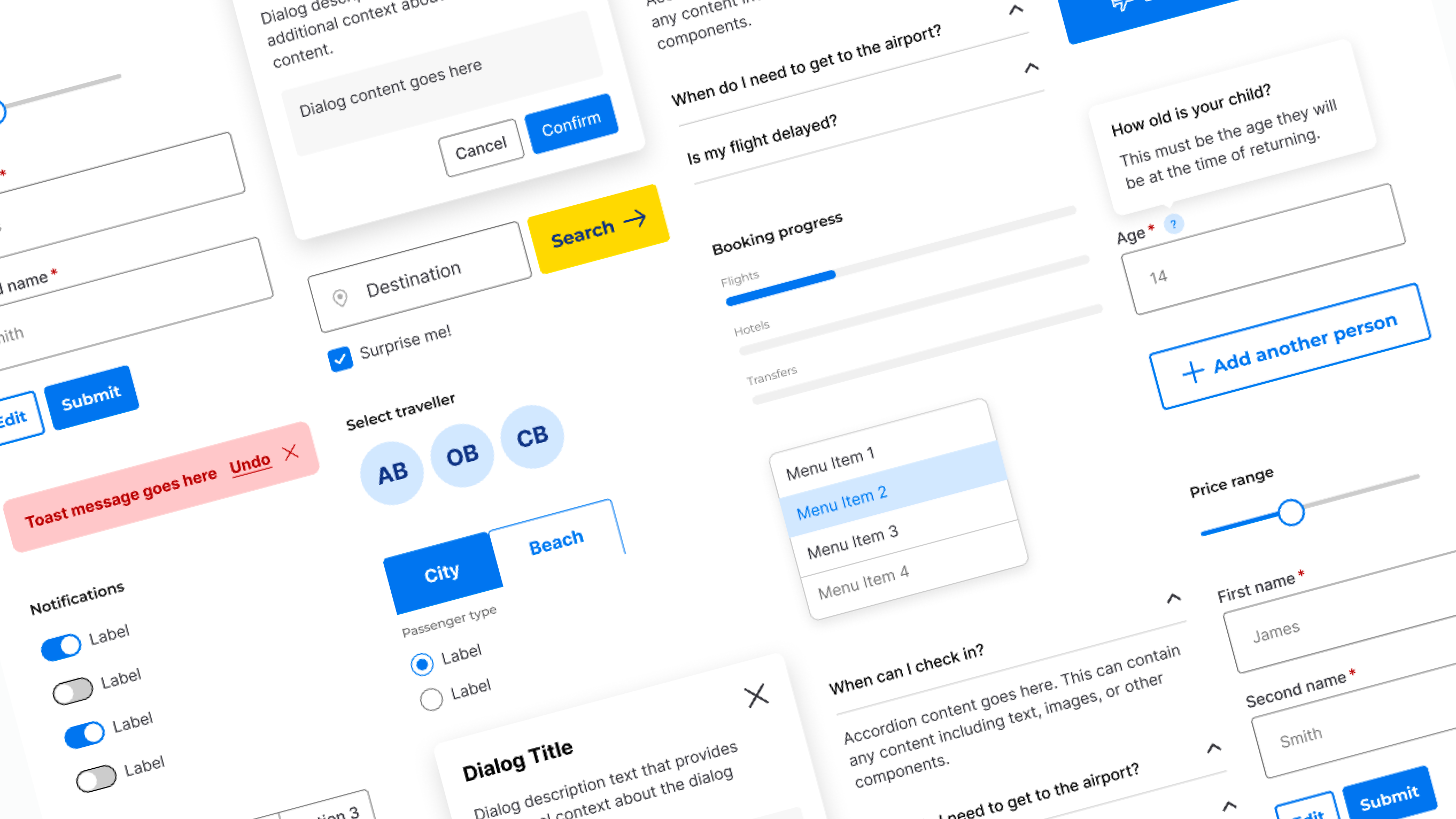
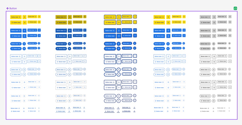
Variants and documentation
Every component ships with a full set of variants covering size, state, and brand. These are documented as structured properties in Figma so designers can compose screens without guessing, and mapped one-to-one in Storybook for developers.
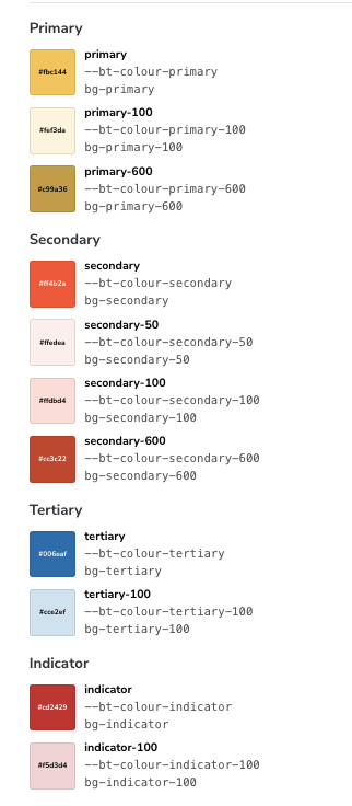
Multi-brand support
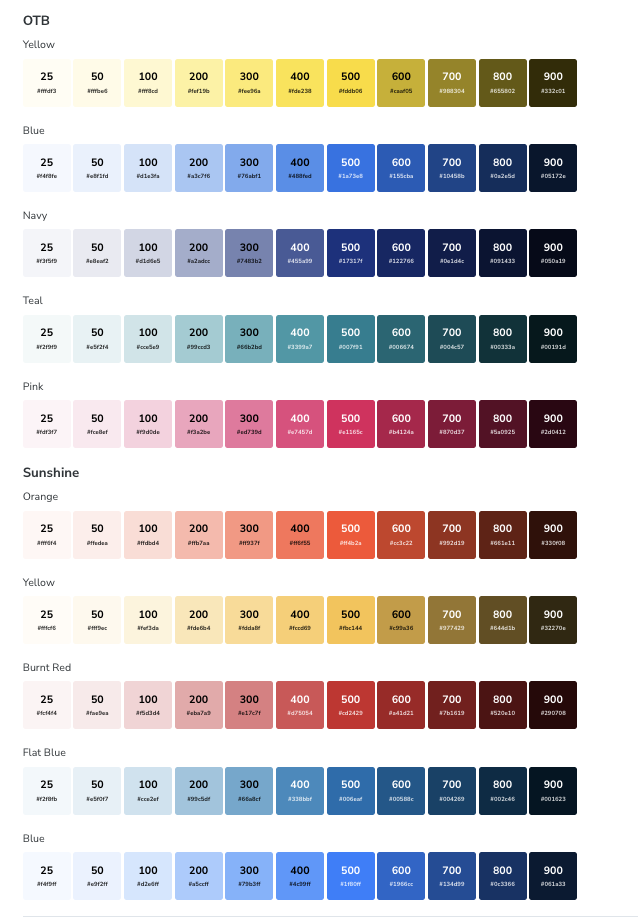
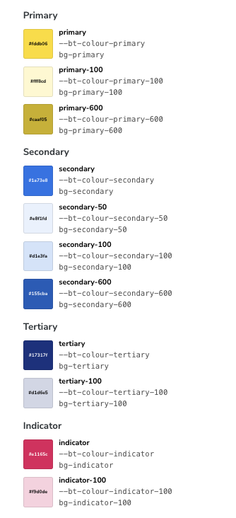
On The Beach operates several brands, each with its own colour palette and visual identity. Beach Towel supports all of them through a shared token layer. Semantic tokens like primary and secondary resolve to different palettes per brand, so the same component works everywhere without override hacks.
Agentic workflows with Claude Code
I’ve been exploring how agentic flows can accelerate design system work. Using Claude Code with custom skills, an engineer or designer can initiate a component build or update and have an MR generated that is typically 90–100% accurate, with a human in the loop for review.
On the design side, I’m exploring the Figma MCP to close the feedback loop between Figma and code. The goal is for changes in either direction to stay in sync with minimal manual effort.
Integrating into existing projects
The biggest challenge was rolling Beach Towel into existing applications that already used an older version of Tailwind. A wholesale migration wasn’t realistic, so we adopted a prefixed-class strategy. Beach Towel classes are namespaced to avoid interference with legacy styles.
This lets teams adopt new components page by page, running Beach Towel alongside existing UI without conflicts. Over time, legacy components are replaced and the prefix becomes the default.